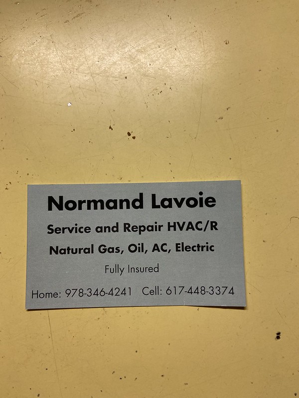
The minimalism and use of space in this business card is very effective. It allows the business card to have a nice read to it and not get lost in other images.
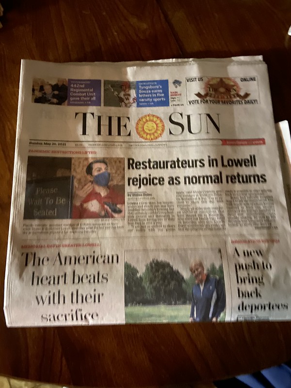
The dominance of the title of the sun is very poor in my opinion. I believe it is taken over by way too many other things going on for the dominance to be overpowering to have the title as a main focus.
The message the pizza place is trying to send is shown in this image. Half the item is coupons, so it shows how much they want you to buy from their store. I do think that this was effective on the message they were setting.
The colors used in this product was very effective. They are emphasizing the red color which allows the buyer to know there are a lot of strawberries whether there are a lot of strawberries or not.
This is a bad representation of color to me. They have too many colors in the product title when I believe they should have stuck to green or an absence color like black or white.
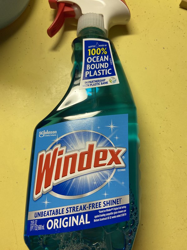
The typography is used very good because is very slick and presented in the center. They emphasize the brand by allowing the name to be in the middle of the bottle.